WoahBiz
Growth Platform for Small Businesses - All-in-one CRM-driven marketing ecosystem for Belgian SMEs
Product
WoahBiz, an all-in-one CRM-driven marketing ecosystem for small businesses
Users
Restaurant owners, retailers, salon managers, and family-run businesses with varying digital literacy
Focus
Product architecture, progressive complexity, and usability for non-technical operators
Contribution
Lead UX and product direction across flows, system structure, and a scalable design foundation
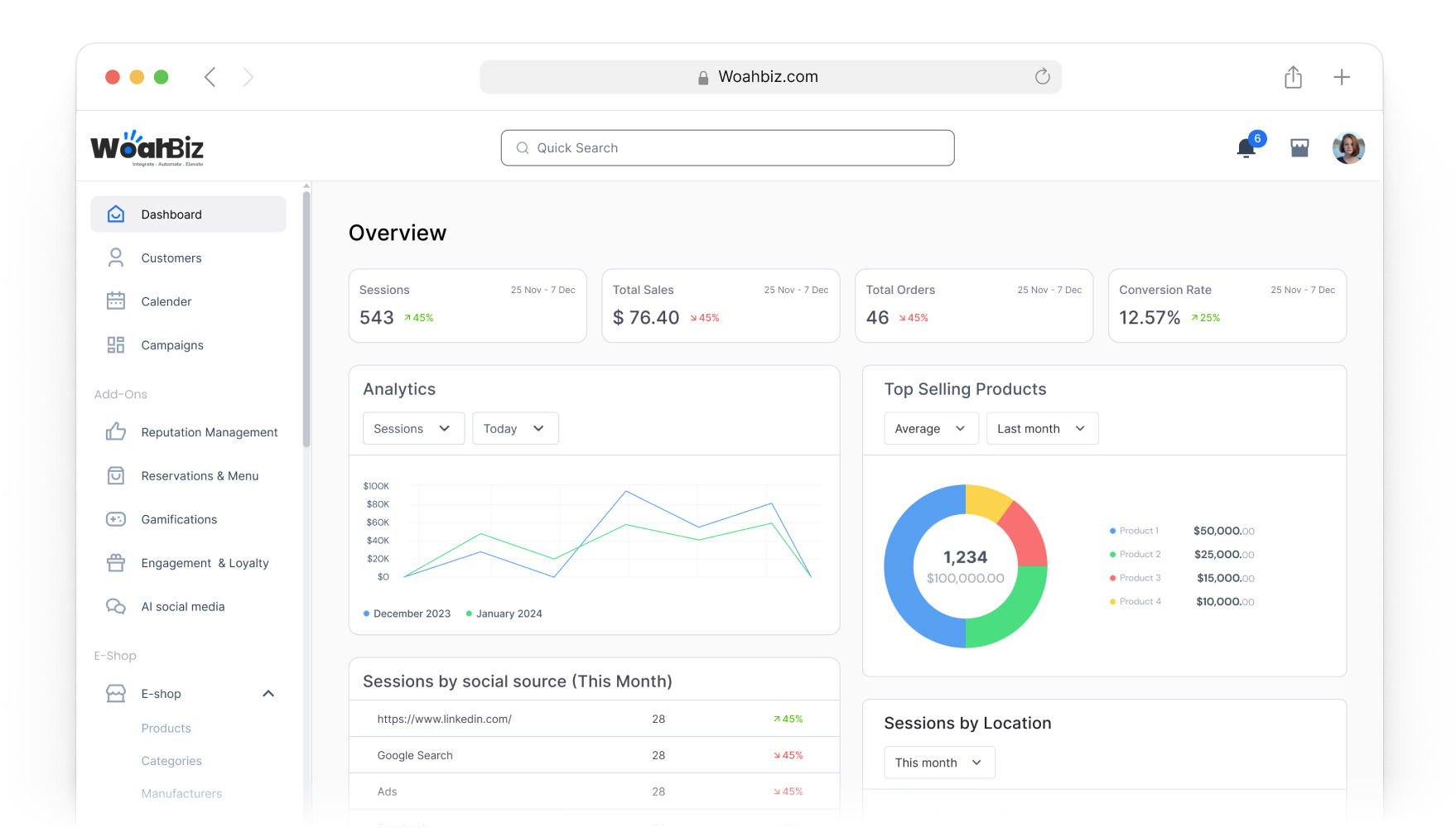
Live prototype
Context
During the COVID period, small and medium-sized businesses in Brussels faced sudden operational disruption. Physical stores were forced to close, and many businesses had little to no structured digital presence.
Most of these businesses:
- Had no digital marketing team
- Used disconnected tools
- Lacked customer data visibility
- Struggled with digital complexity
The original idea was to provide affordable websites to help businesses maintain an online presence. Early adoption validated the demand, with 50+ businesses onboarding in a short period.
However, it quickly became clear that a website alone was not enough.
Businesses needed a system that could:
- Manage customer relationships
- Automate communication
- Enable reservations and digital menus
- Support QR-based interactions
- Handle e-commerce and promotions
- Provide actionable insights
WoahBiz evolved from a simple website solution into a CRM-centered growth platform.
The Challenge
The hardest UX challenge was not adding features — it was preventing complexity.
Small business owners in Brussels had varying levels of digital literacy. Many were:
- Restaurant owners
- Retail shop operators
- Salon managers
- Family-run businesses
They were time-constrained and operationally focused.
The platform needed to:
- Integrate multiple modules (CRM, campaigns, QR, reservations, loyalty, automation)
- Feel powerful but not overwhelming
- Be scalable without becoming fragmented
- Support business growth without increasing cognitive load
The key question became:
How do we design an all-in-one growth system that feels simple enough for non-technical users?
My role
I was the sole UX designer on the project, working directly with the founder and developers.
My responsibilities include:
- Structuring the overall product architecture
- Translating client feedback into product decisions
- Designing end-to-end user flows across all modules
- Supporting feature prioritization
- Aligning UX decisions with subscription and pricing strategy
- Creating and maintaining a scalable design system
- Supporting front-end implementation for consistency
This role extended beyond interface design. I contributed to product direction, monetization clarity, and long-term scalability.
Exploration & Framing
Before moving deeper into interface design, I spent time mapping the people, business models, and operational patterns the platform needed to support.
This was important because WoahBiz was not serving a single business type. It needed to work for cafes, florists, food businesses, salons, and other local merchants, each with different promotional needs, customer behaviors, and operational rhythms.
I used early exploration work to clarify:
- Who the core user groups were inside the ecosystem
- How merchants differed by business type and marketing behavior
- Which journeys were repeated often enough to shape the product structure
- Where the platform needed flexibility versus standardization
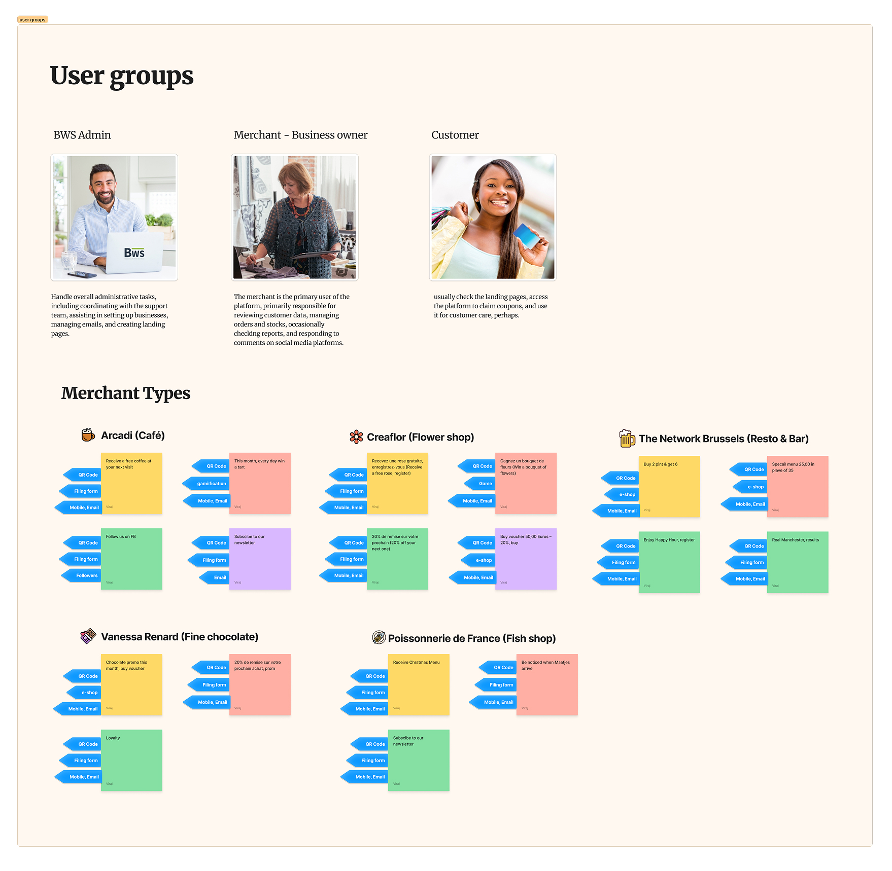
User Groups & Merchant Archetypes
The exploration surfaced three primary user groups. Each one had a different relationship with the platform and influenced the product in a different way.
- BWS admin needed to coordinate setup, support merchants, manage emails, and create landing pages.
- Merchants were the main operators of the platform, reviewing customer data, managing offers, monitoring orders or stock, and occasionally responding to reviews and social comments.
- Customers interacted with the output of the system through landing pages, coupons, campaigns, and follow-up communication.
From there, I looked more closely at merchant types. A cafe, flower shop, chocolatier, fish shop, and bar all needed different campaign structures, but there were still patterns that could be reused.
That helped us identify repeatable building blocks such as:
- QR-led campaign entry points
- Simple lead capture forms
- Email or mobile-based follow-up
- Offer redemption and loyalty loops
- Light e-commerce and voucher flows
This work shaped how I thought about templates, modular flows, and what the platform should make easy by default.
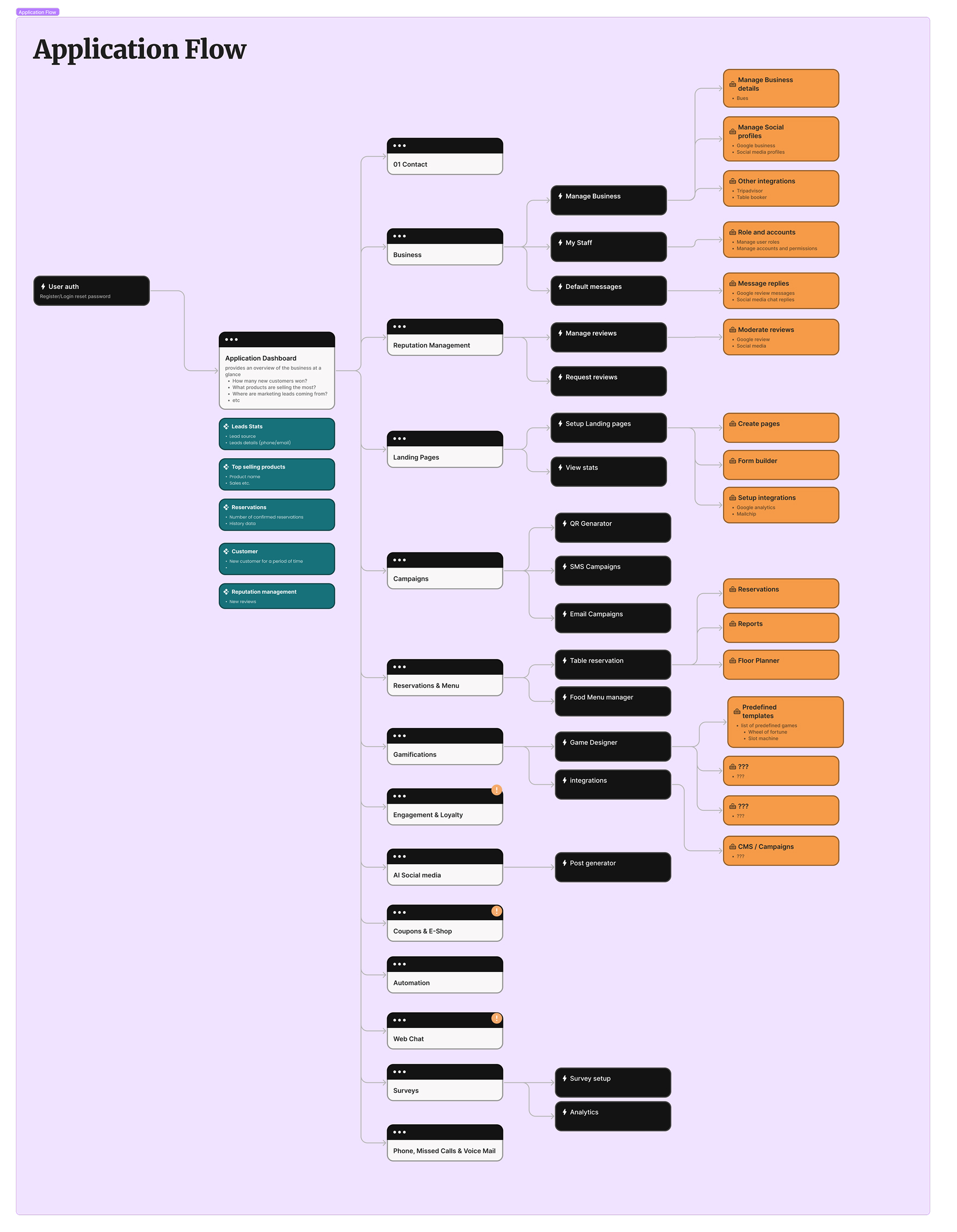
System Mapping
Once the business scenarios became clearer, I mapped the application structure as a full system rather than as isolated features.
The platform had to connect a large set of modules: business setup, staff management, review management, landing pages, campaigns, reservations, gamification, loyalty, social content, e-commerce, automation, web chat, surveys, and analytics.
Creating an end-to-end application flow made it possible to:
- See where features belonged in the product architecture
- Reduce duplication across modules
- Clarify the relationship between dashboard entry points and downstream tasks
- Identify where a CRM-centered structure could create coherence across the system
This was one of the most important steps in keeping the product scalable. Without this view, the platform could easily have become a set of disconnected tools.
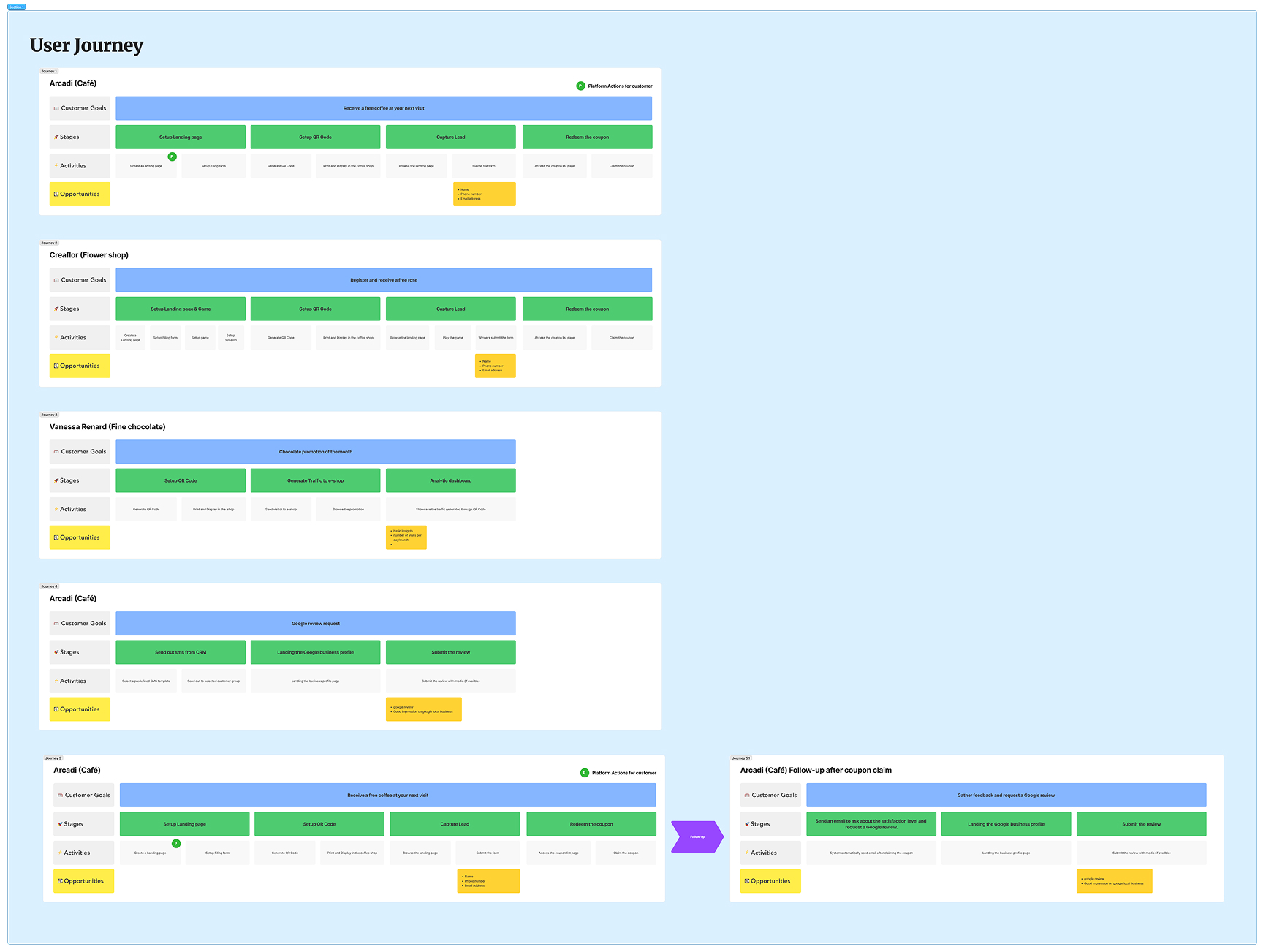
Journey Design
To make the platform usable for non-technical business owners, I translated the system map into specific user journeys.
These journeys focused on practical business actions rather than abstract features. For example:
- Setting up a landing page and QR code to capture leads
- Running a campaign tied to an offer or voucher
- Driving traffic to a small e-shop experience
- Following up with customers after a coupon claim
- Requesting and moderating reviews after a visit
This helped break complex workflows into understandable stages, from setup to activation to follow-up. It also revealed where the platform needed stronger support around content, onboarding, and next-step guidance.
Module-Level Exploration
After the broader architecture was defined, I explored key modules in more detail to make sure the structure would hold up in day-to-day use.
Two examples were particularly important:
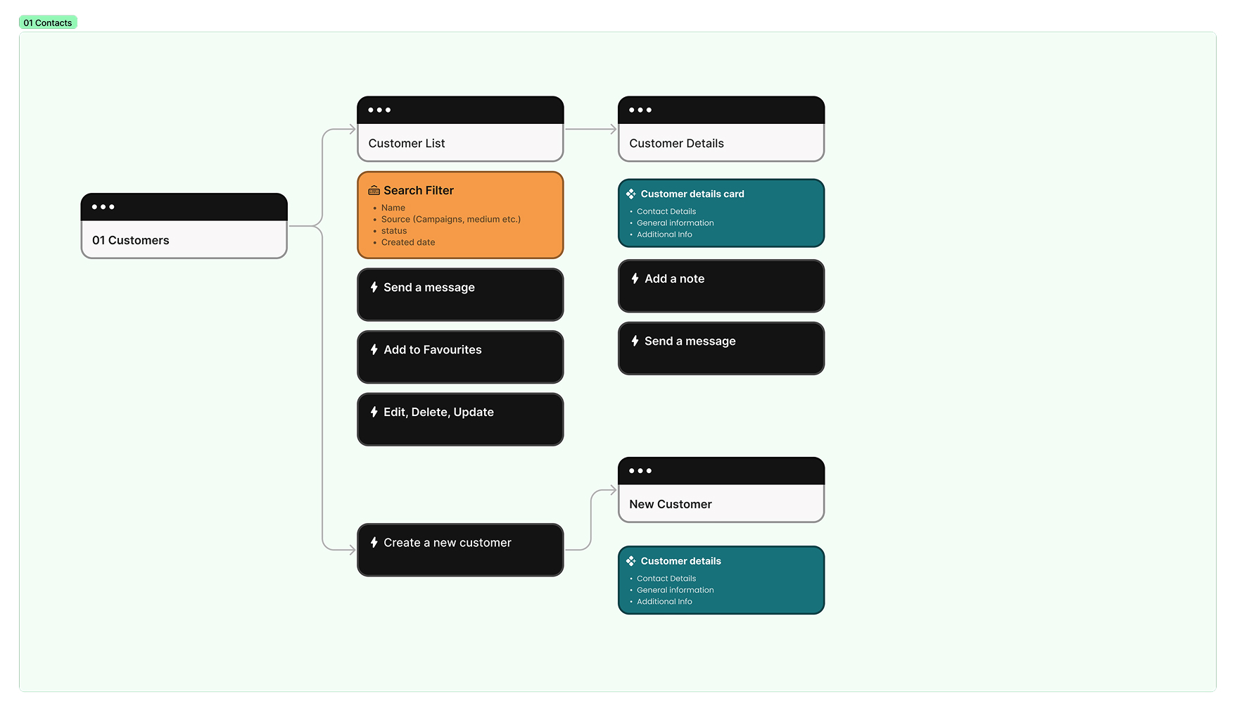
- Contacts: I mapped list views, detail views, customer creation, filtering, note-taking, messaging, and favorites so the CRM stayed practical rather than administrative.
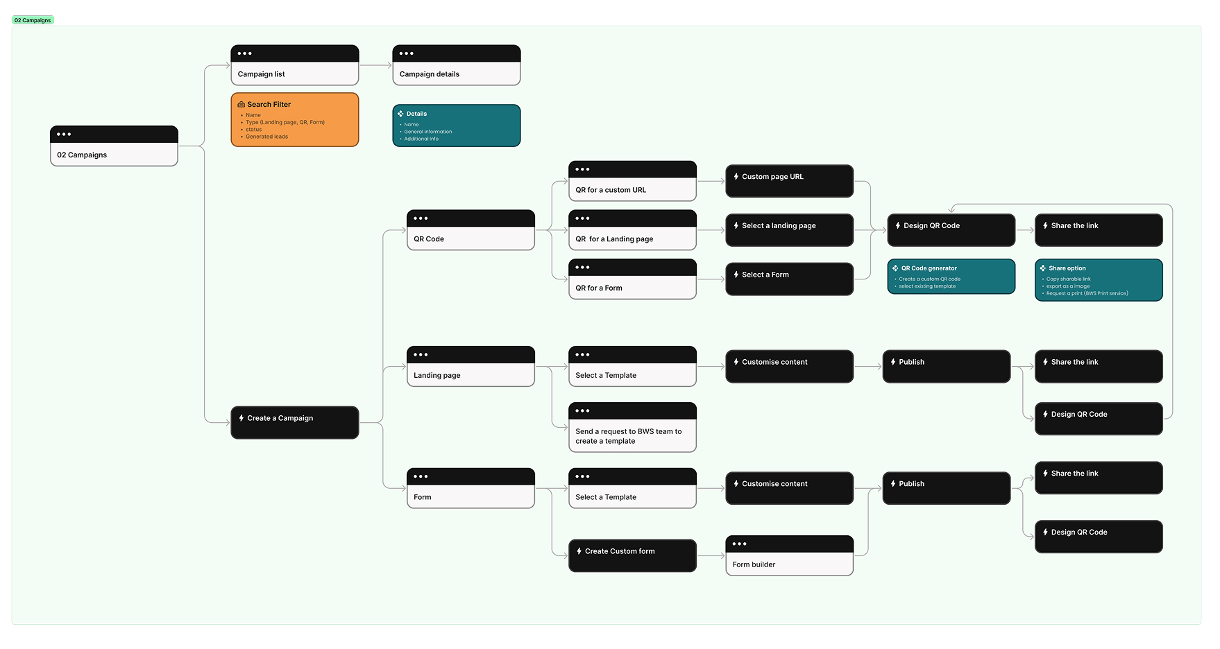
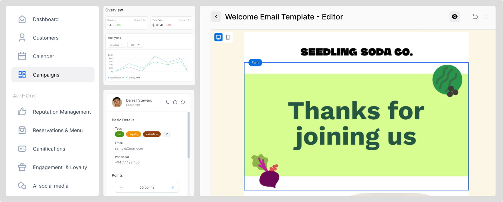
- Campaigns: I mapped how users could create a campaign from different starting points, including QR codes, landing pages, and forms, while still keeping the publishing flow understandable.
This kind of module-level exploration helped validate that the product structure could support real usage and not just high-level feature ideas.
Design Approach
1. CRM as the Core
Instead of building disconnected tools, I structured the system around a central customer database.
All modules — campaigns, automation, QR, reservations, loyalty — connected back to the CRM.
This allowed:
- Segmentation
- Targeted communication
- Automated triggers
- Measurable engagement
This architectural decision ensured long-term scalability.
2. Progressive Complexity
Rather than exposing all features at once, the system was designed to reveal functionality progressively.
- Clear primary actions on dashboards
- Modular navigation
- Structured information hierarchy
- Template-based campaign creation
Users could start simple and expand over time.
3. Consistent Interaction Patterns
- Reusable components
- Standardized spacing and layout rules
- Clear visual hierarchy
- Predictable feedback states
- Structured form behaviors
This prevented UI fragmentation as new modules were added.
Accessibility & Usability
A significant portion of the user base included older business owners and users with limited technical familiarity.
Key usability considerations included:
- High-contrast interface design
- Clear typography hierarchy
- Reduced visual clutter
- Large, clearly labeled primary actions
- Avoiding hidden actions behind complex interactions
- Minimal reliance on icon-only meaning
- Clear error and success feedback
Workflows were simplified to reduce cognitive load, particularly for users who were unfamiliar with CRM systems or automation logic.
The system was designed to feel reassuring rather than technical.
Impact
- Successfully onboarded 50+ small and medium businesses
- Enabled businesses to maintain digital operations during lockdown
- Expanded from a website tool into a multi-module growth platform
- Introduced structured automation for non-technical users
- Established a scalable UX foundation through a formalized design system
The platform transitioned from crisis-response tooling into a structured long-term growth solution.
Reflection
Designing WoahBiz reinforced a fundamental principle:
Even small businesses require:
- Clear architecture
- Consistent interaction systems
- Scalable design foundations
- Thoughtful feature prioritization
Working as the sole designer strengthened my ability to:
- Drive product direction
- Balance speed with structure
- Collaborate closely with founders
- Translate business needs into usable systems
- Maintain simplicity within expanding complexity
WoahBiz was not just about building features.
It was about building clarity under pressure.
Continue Exploring
Explore more work
Home
Back to portfolio overview
Return to the main work selection page.
Next Read
Enterprise UX at Allianz
A multi-market enterprise case study focused on workflows, scale, and accessibility.
Also View
BrusselsLife Digital Reading
A content platform redesign shaped by analytics, editorial UX, and monetization goals.